Typography Project 1: Hello Type!
A Beginner’s Guide to Typography Anatomy
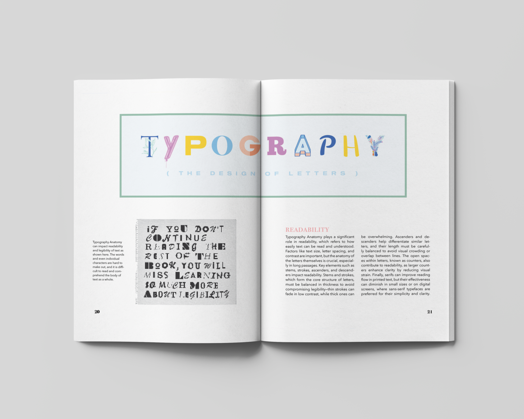
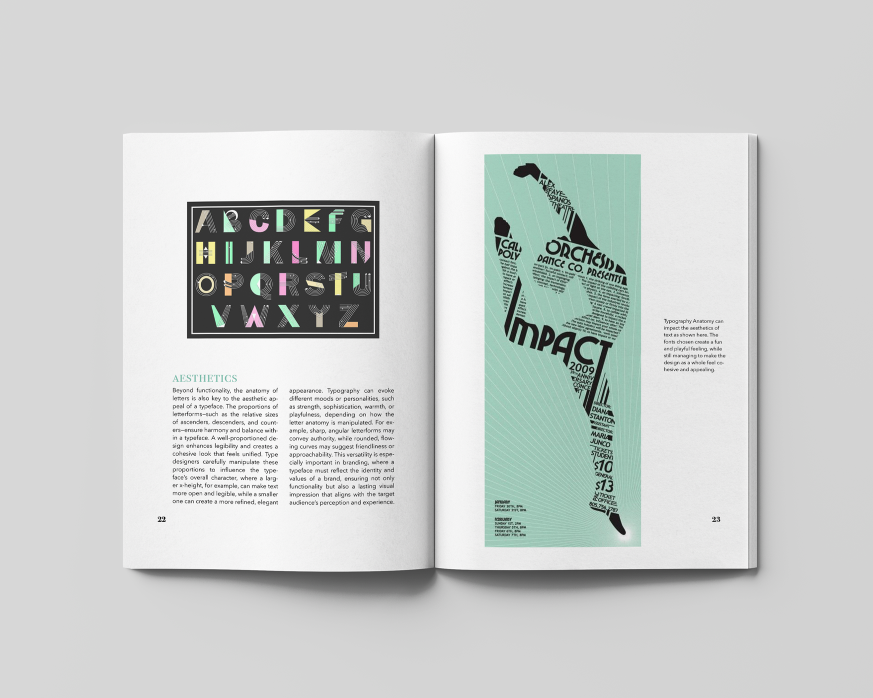
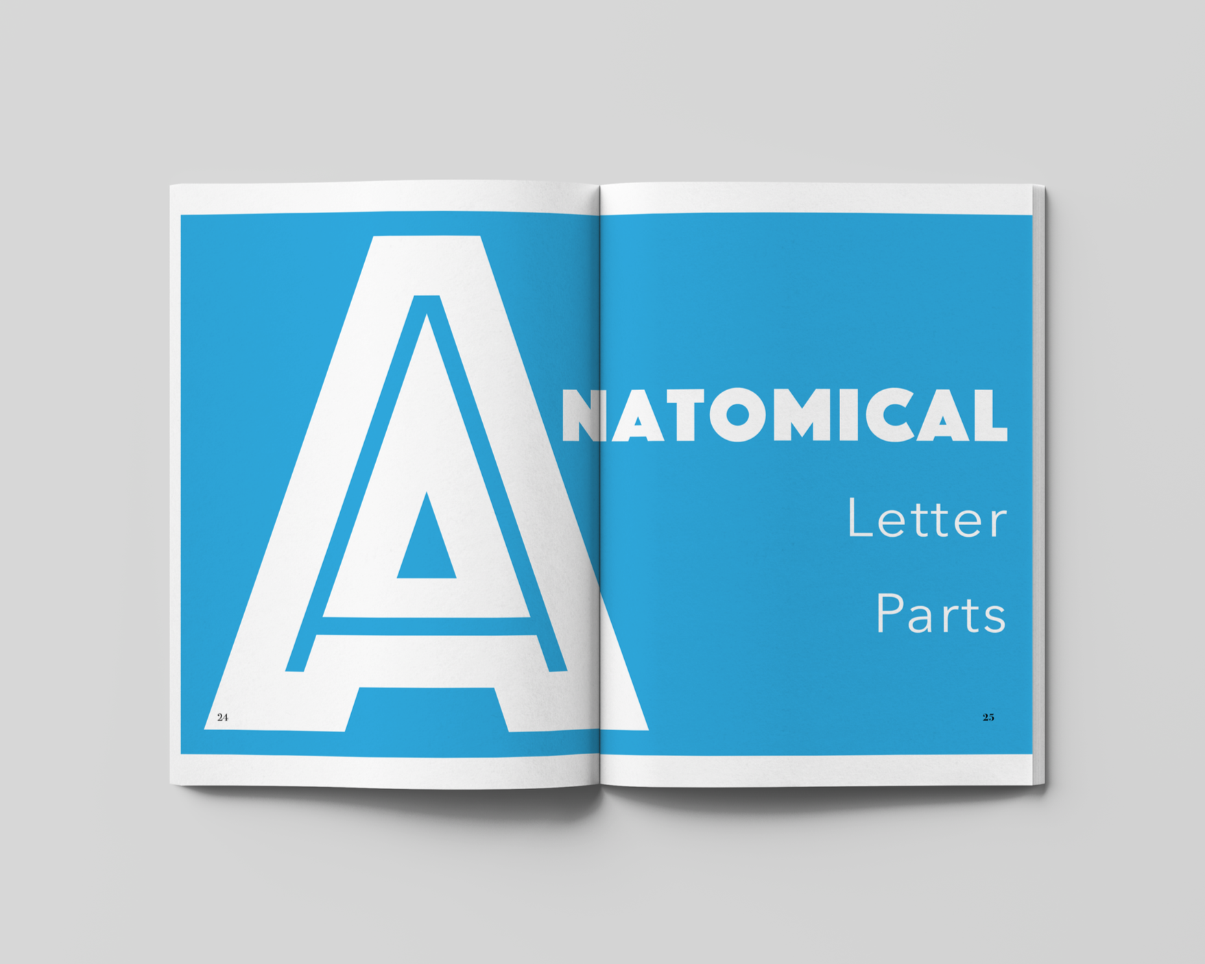
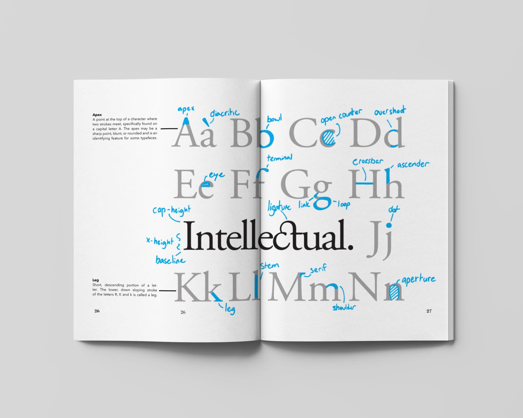
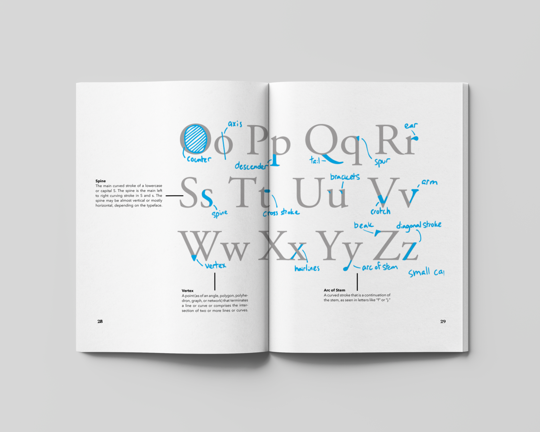
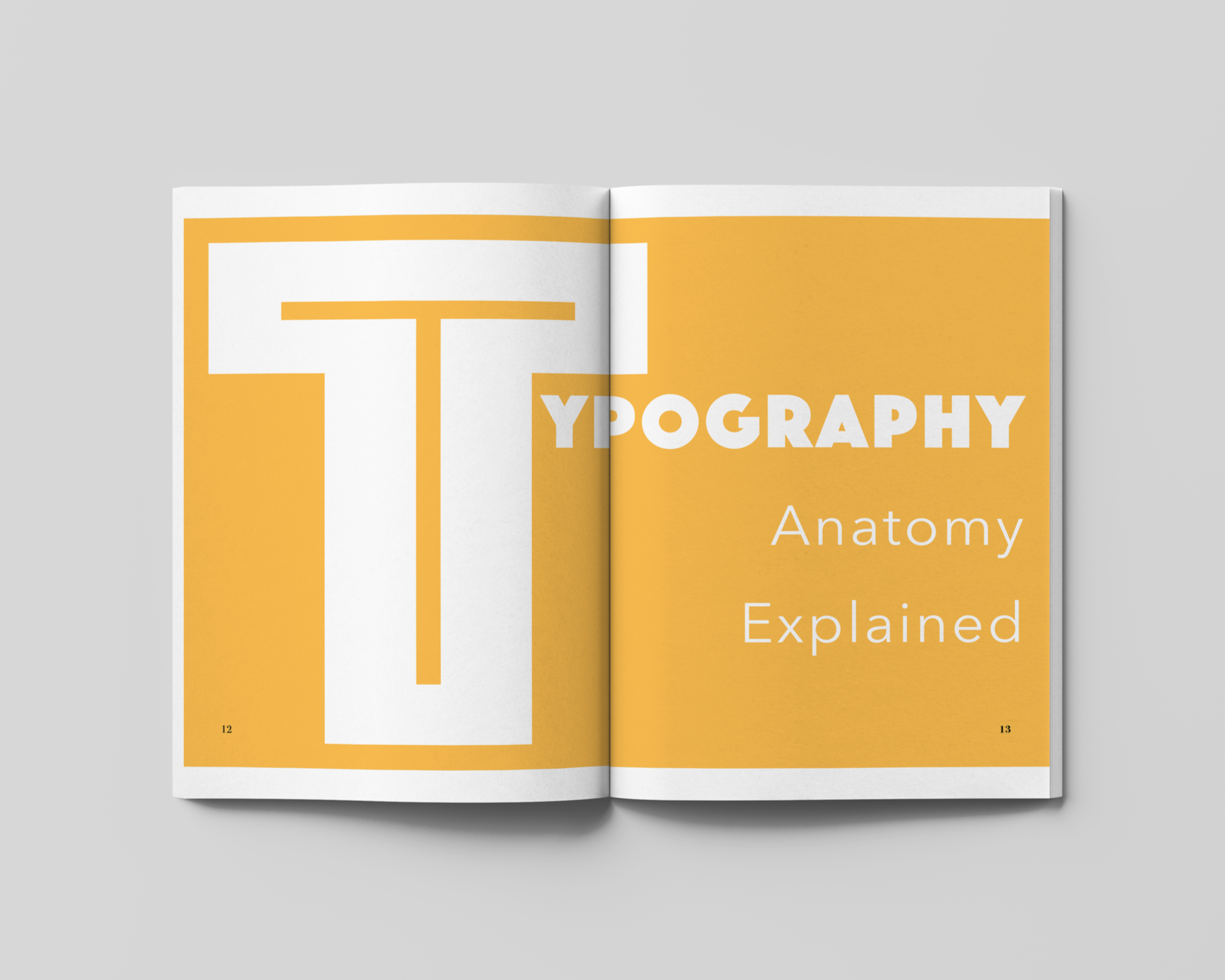
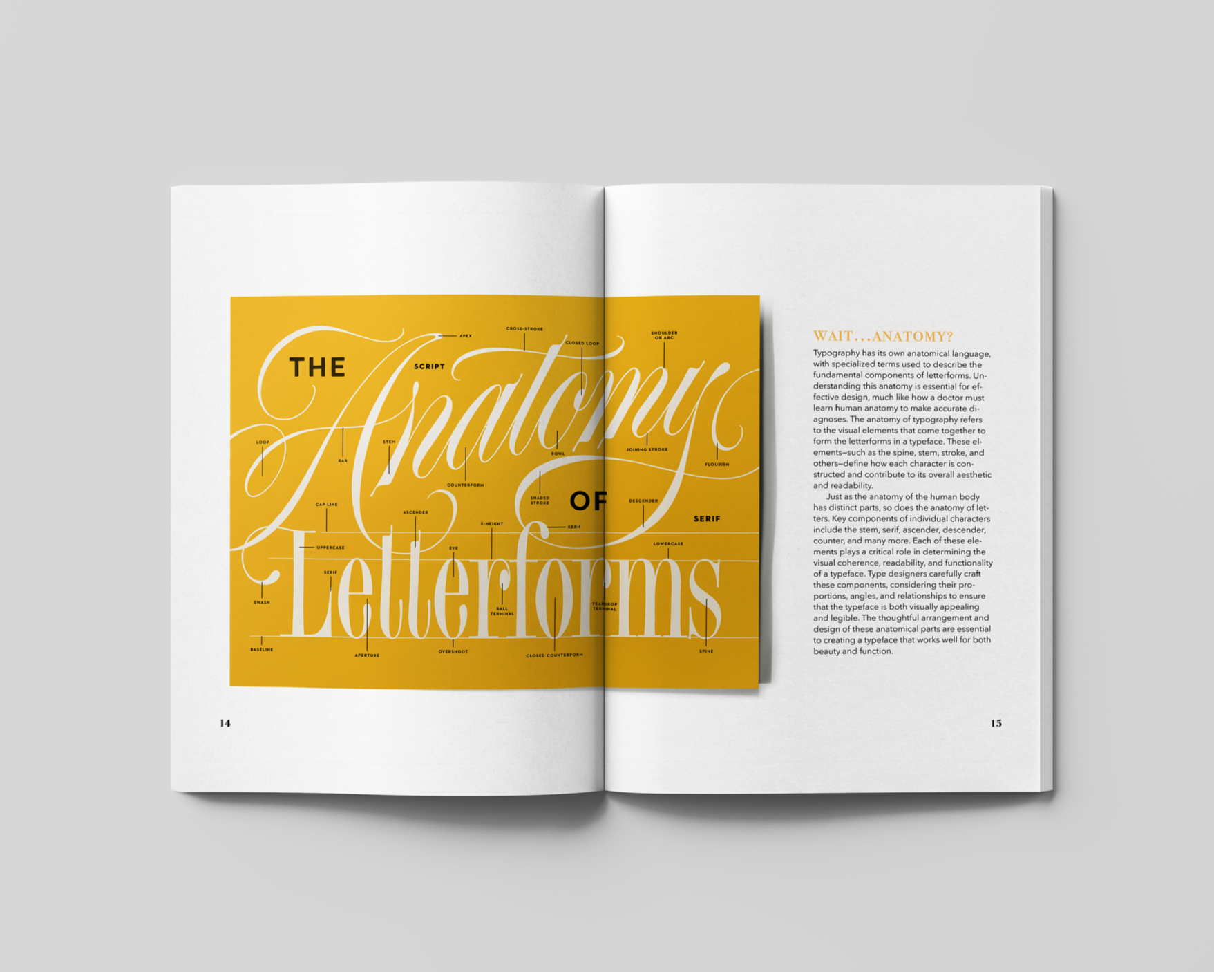
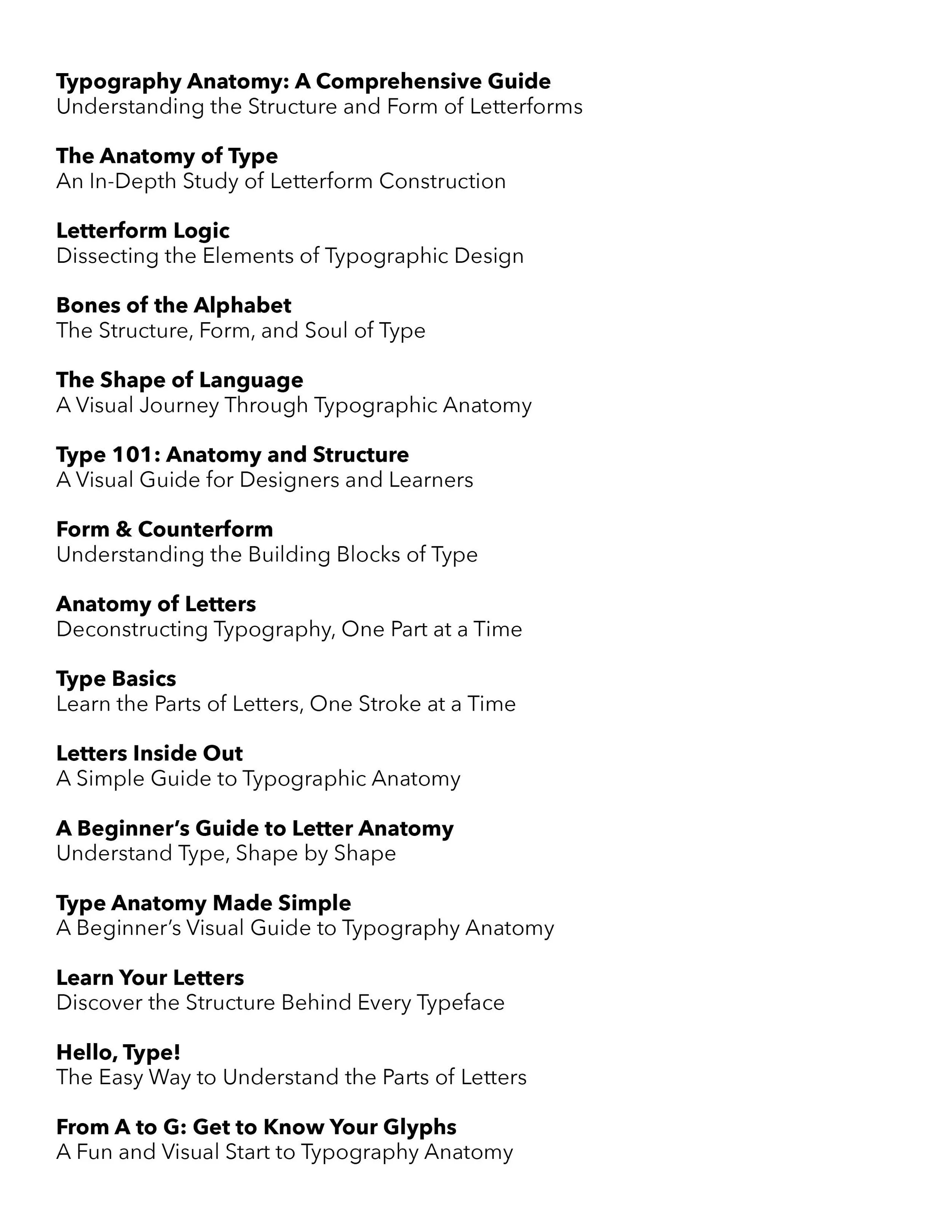
I designed a typography textbook that is a fun, colorful, and engaging beginner's guide to typography anatomy.
Design Process
Software: InDesign
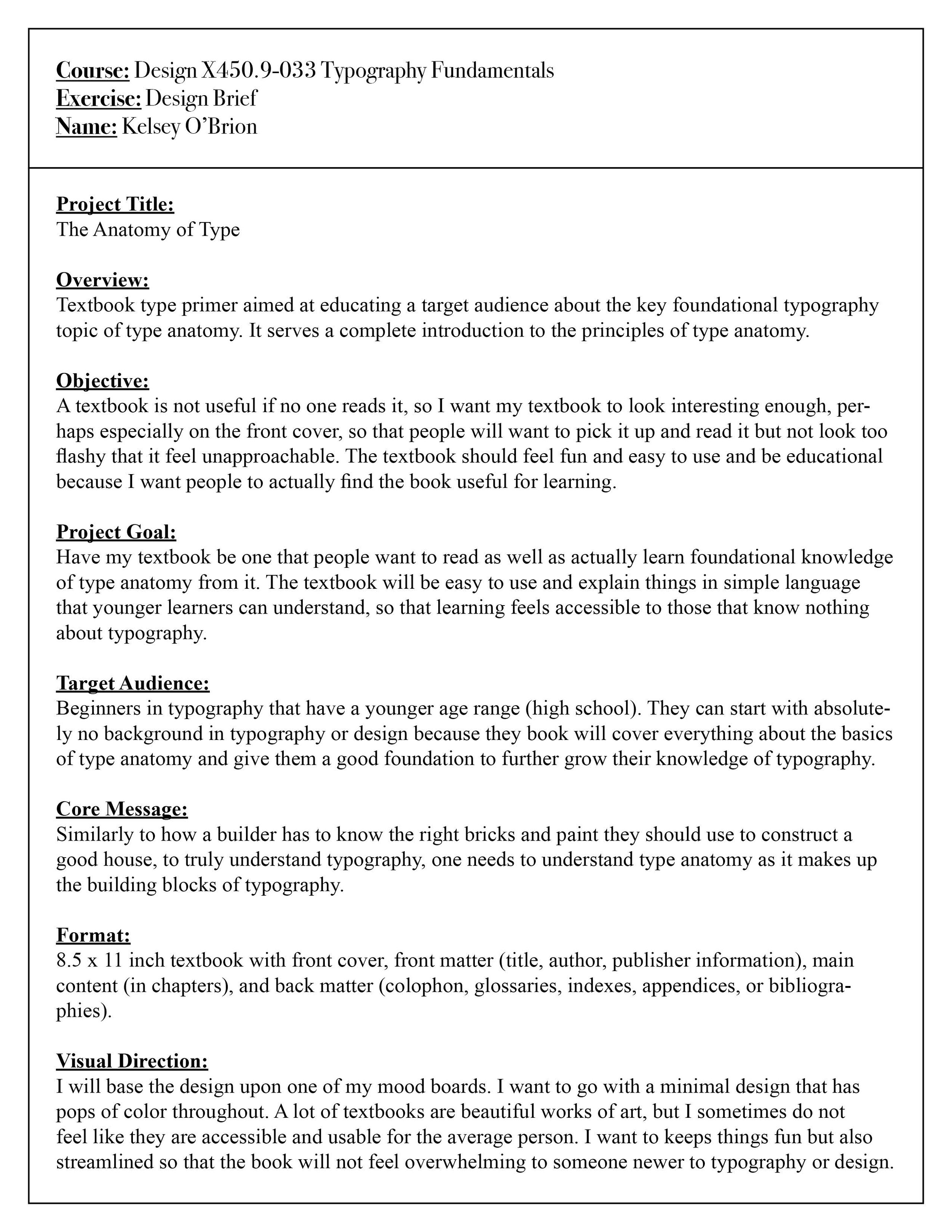
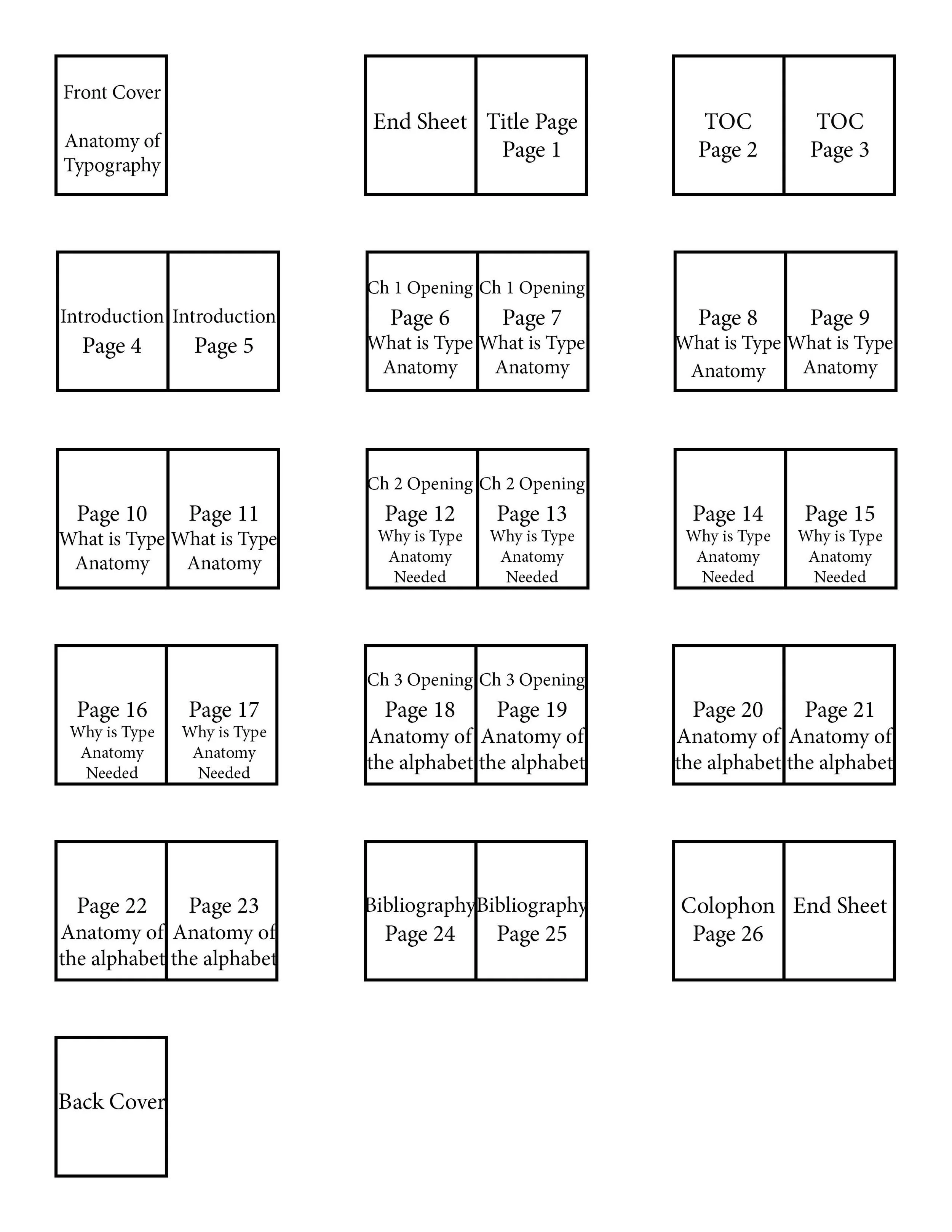
Design Problem: Design textbook type primer aimed at educating a target audience about the key foundational typography topic of type anatomy. It should serve as a complete introduction to the principles of type anatomy. The format should be 8.5 x 11 inch textbook with front cover, front matter (title, author, publisher information), main content (in chapters), and back matter (colophon, glossaries, indexes, appendices, or bibliographies).
Target Audience: Beginners in typography that have a younger age range (high school). They can start with absolutely no background in typography or design because they book will cover everything about the basics of type anatomy and give them a good foundation to further grow their knowledge of typography. Similarly to how a builder has to know the right bricks and paint they should use to construct a good house, to truly understand typography, one needs to understand type anatomy as it makes up the building blocks of typography.
Background: A textbook is not useful if no one reads it, so I want my textbook to look interesting enough, perhaps especially on the front cover, so that people will want to pick it up and read it but not look too flashy that it feel unapproachable. The textbook should feel fun and easy to use and be educational because I want people to actually find the book useful for learning. I want to have my textbook be one that people want to read as well as actually learn foundational knowledge of type anatomy from it. The textbook will be easy to use and explain things in simple language that younger learners can understand, so that learning feels accessible to those that know nothing about typography.
Design Process:
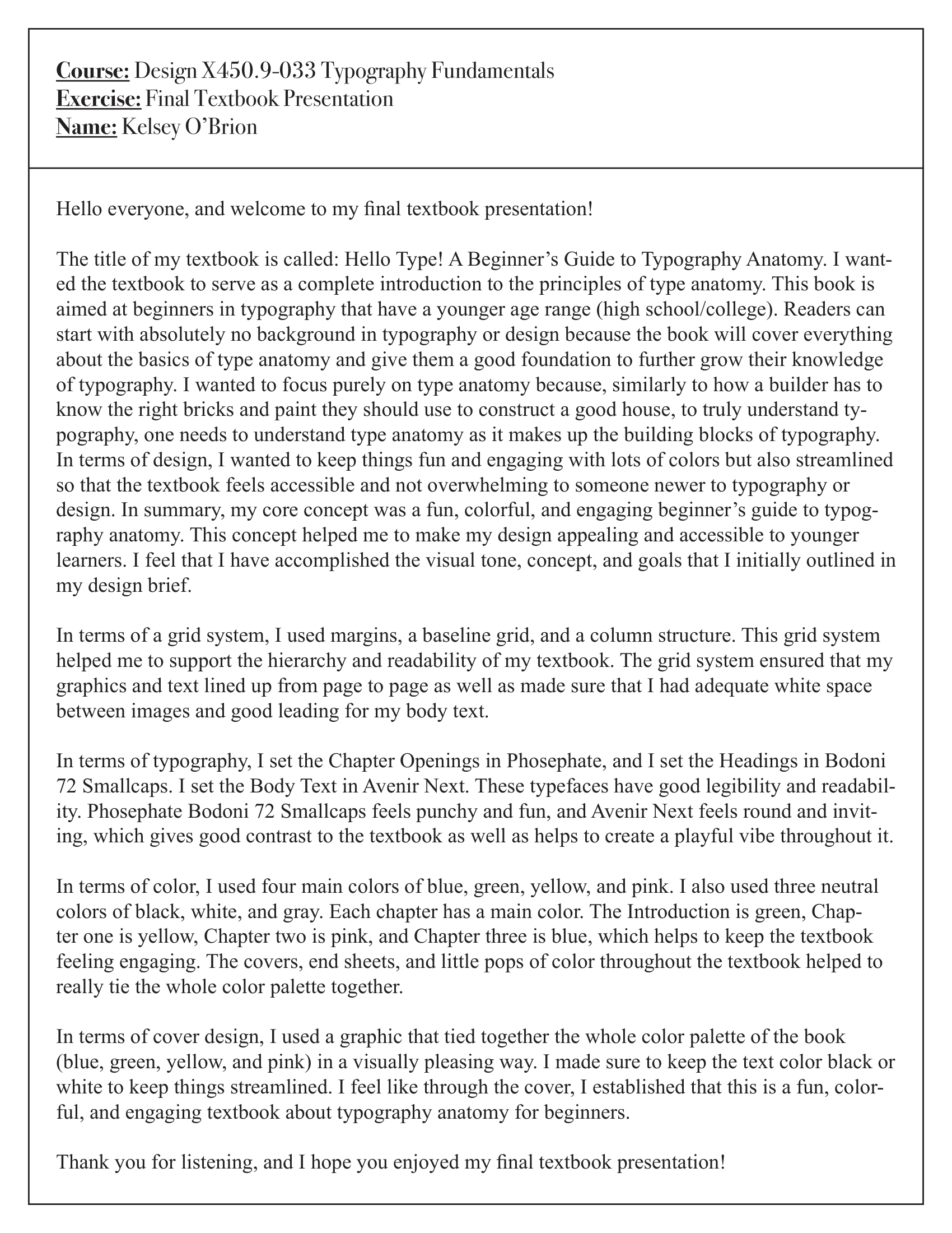
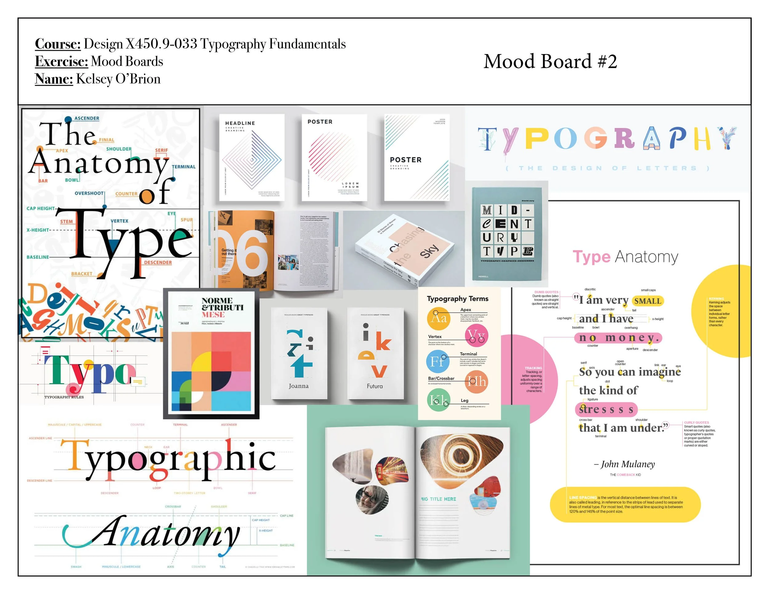
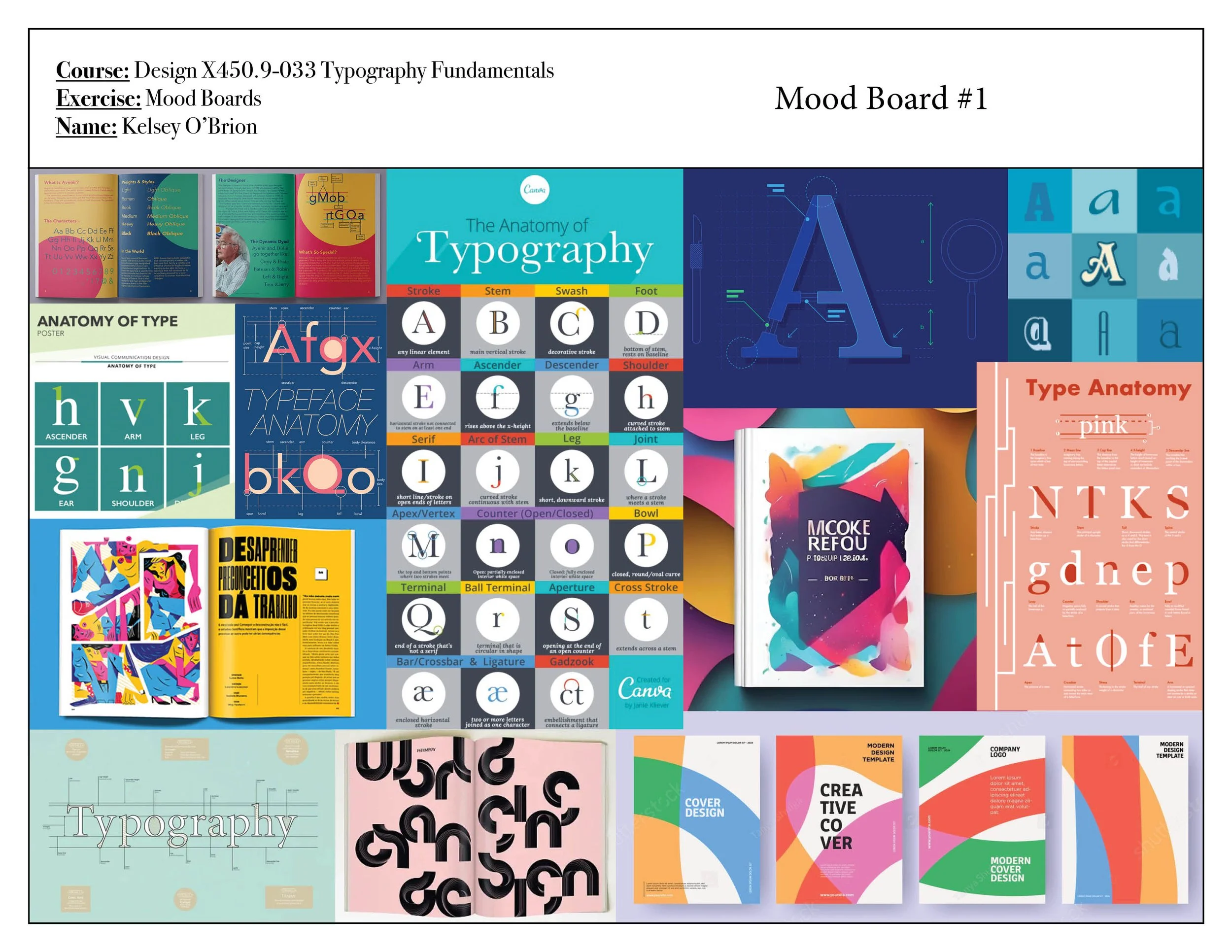
Design: I based the design on one of my mood boards. I decided to go with a minimal design that has pops of color throughout. A lot of textbooks are beautiful works of art, but I sometimes do not feel like they are accessible and usable for the average person. I kept things fun but also streamlined, so that the book does not feel overwhelming to someone newer to typography or design. In summary, my core concept was a fun, colorful, and engaging beginner's guide to typography anatomy. This concept helped me to make my design appealing and accessible to younger learners.
Grid System: I used margins, a baseline grid, and a column structure. This grid system helped me to support the hierarchy and readability of my textbook. The grid system ensured that my graphics and text lined up from page to page as well as made sure that I had adequate white space between images and good leading for my body text.
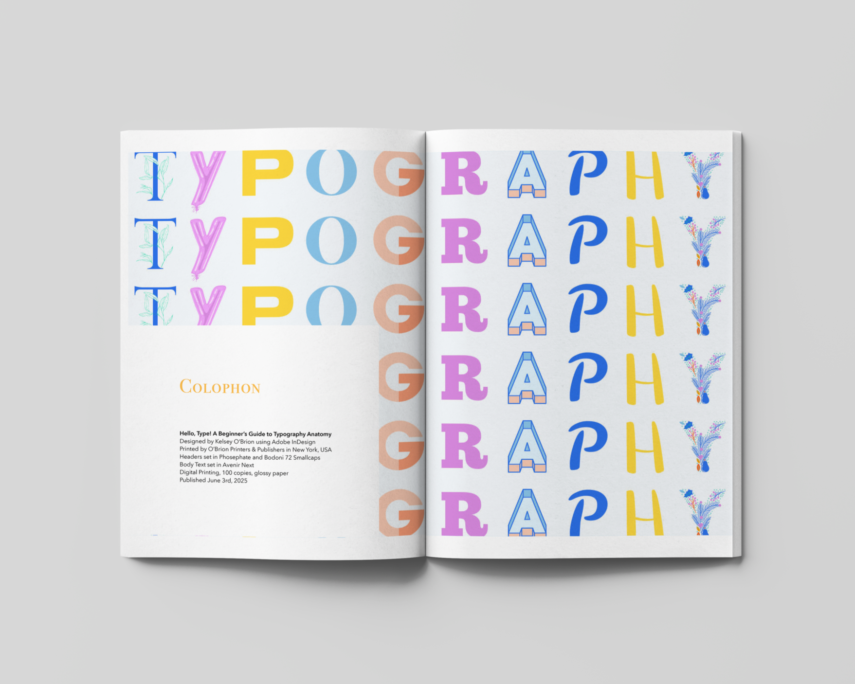
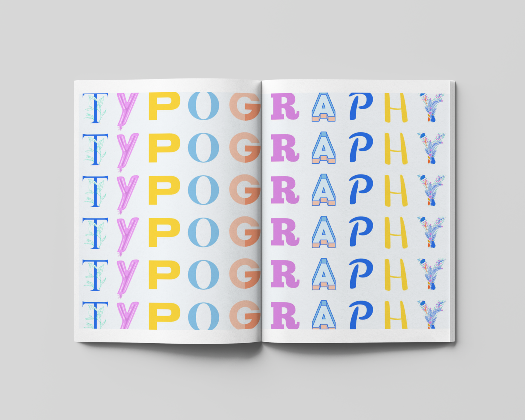
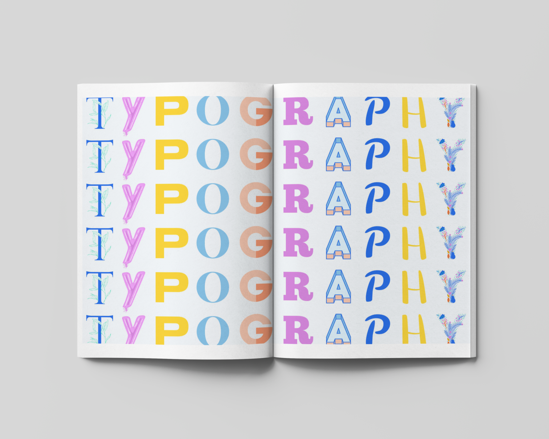
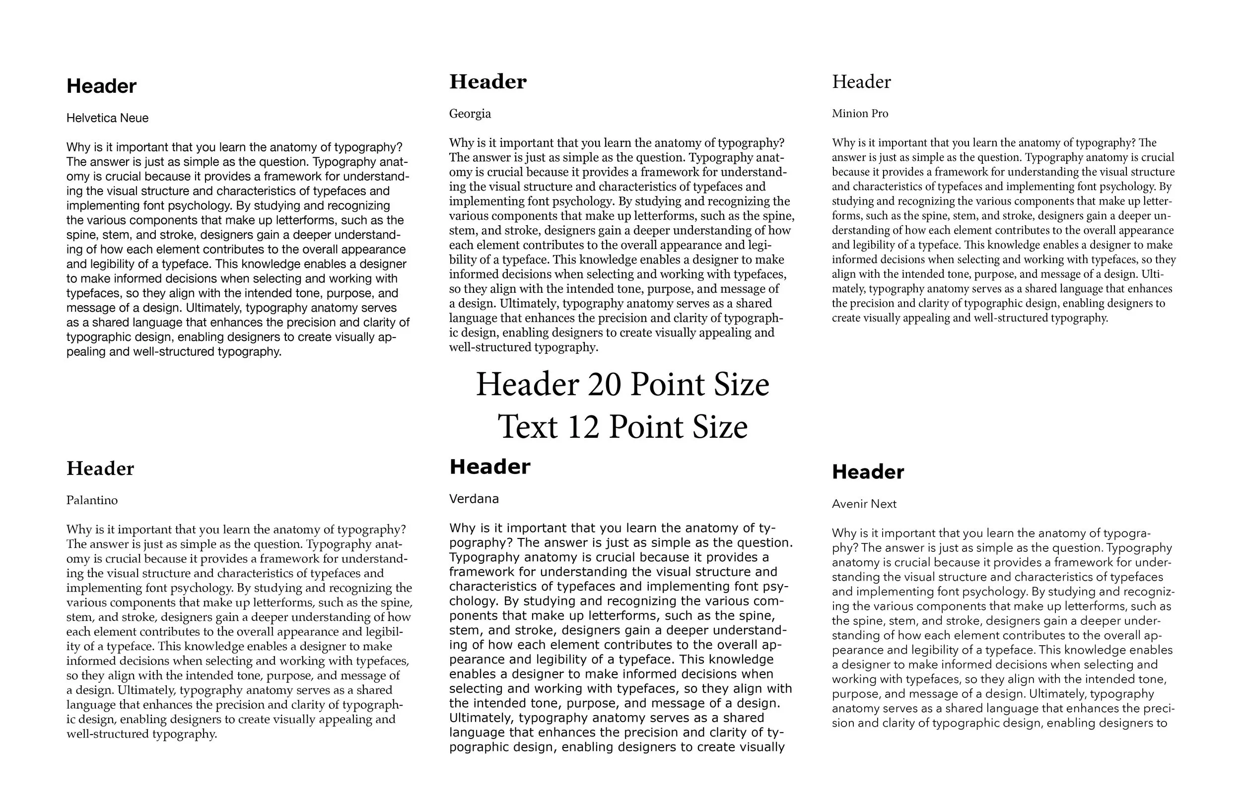
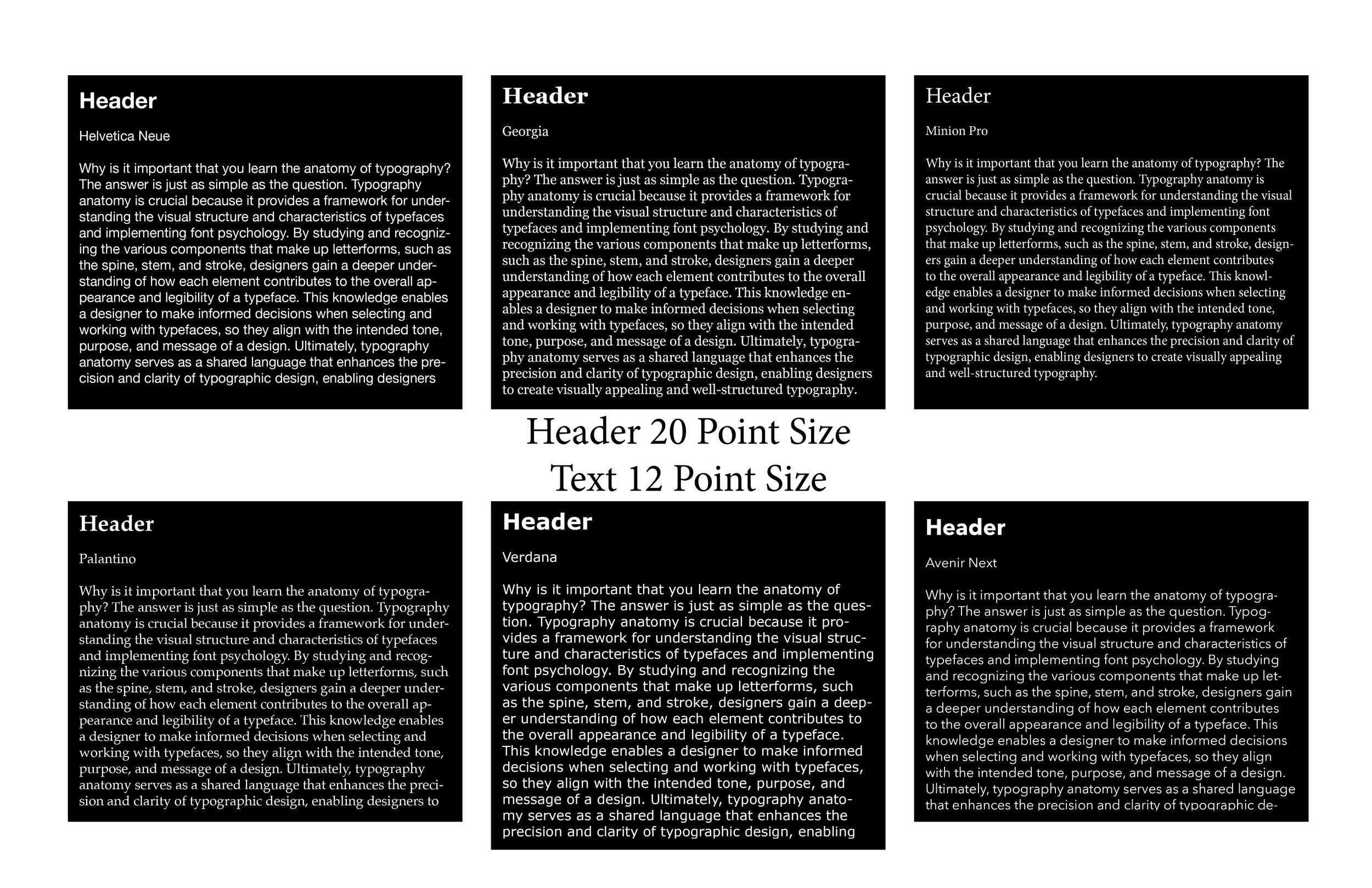
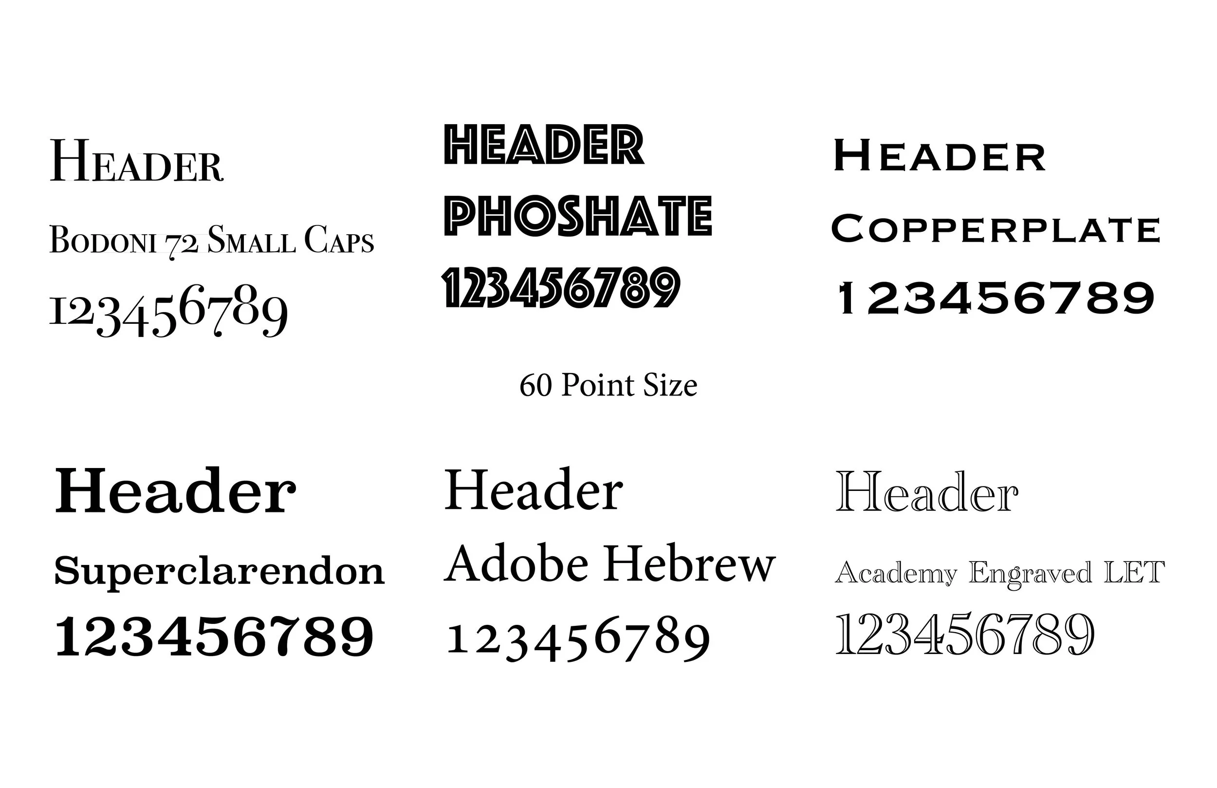
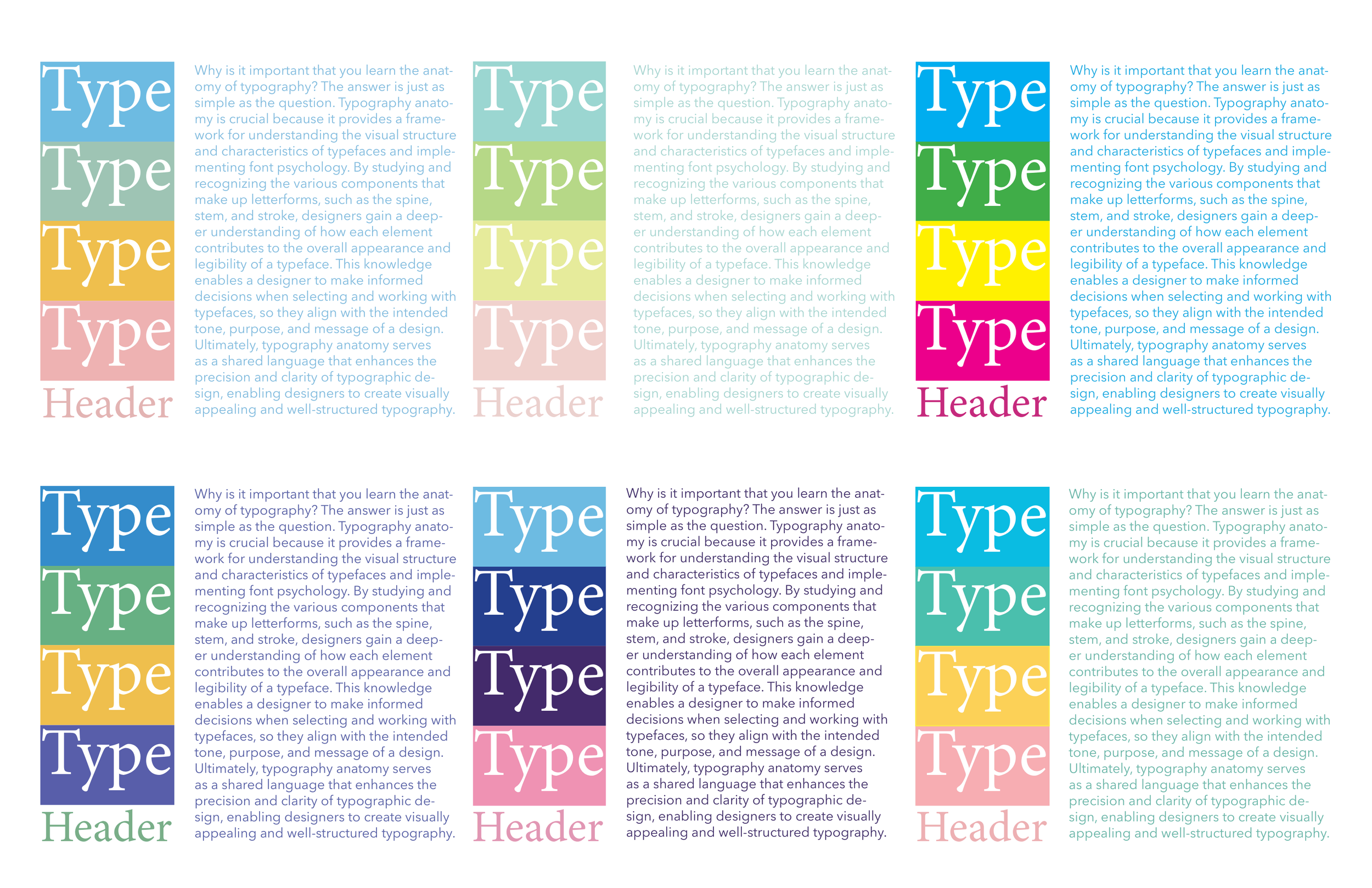
Typography: I set the Chapter Openings in Phosephate, and I set the Headings in Bodoni 72 Smallcaps. I set the Body Text in Avenir Next. These typefaces have good legibility and readability. Phosephate Bodoni 72 Smallcaps feels punchy and fun, and Avenir Next feels round and invit- ing, which gives good contrast to the textbook as well as helps to create a playful vibe throughout it.
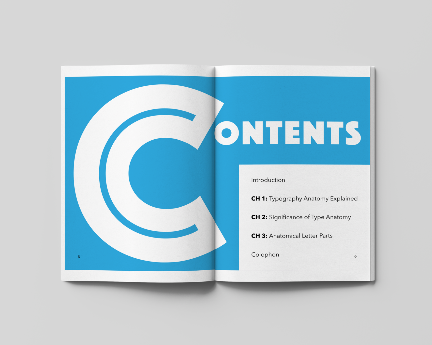
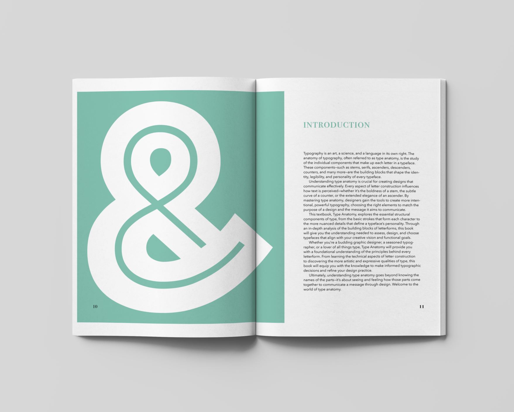
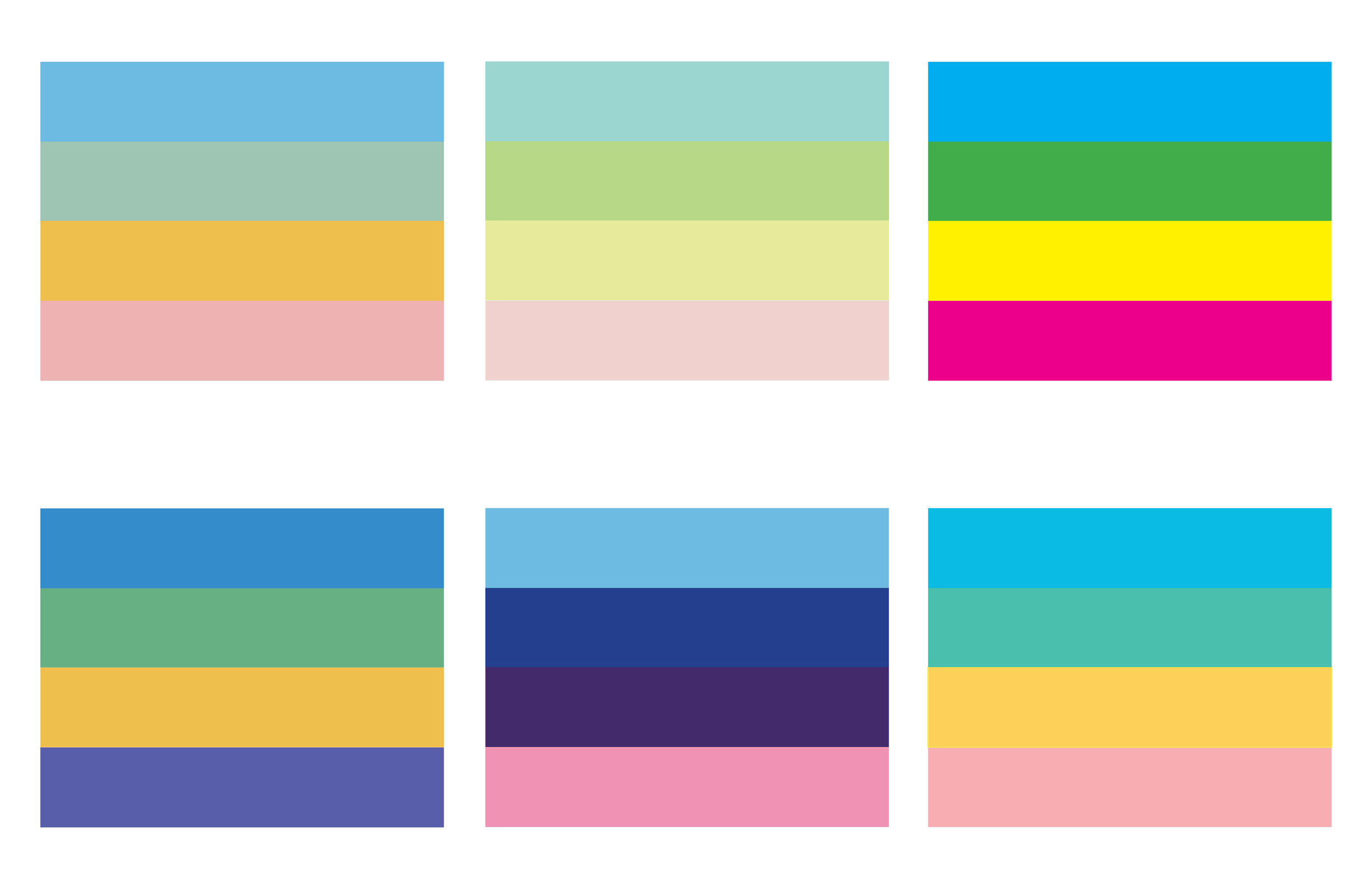
Color: I used four main colors of blue, green, yellow, and pink. I also used three neutral colors of black, white, and gray. Each chapter has a main color. The Introduction is green, Chapter one is yellow, Chapter two is pink, and Chapter three is blue, which helps to keep the textbook feeling engaging. The covers, end sheets, and little pops of color throughout the textbook helped to really tie the whole color palette together.
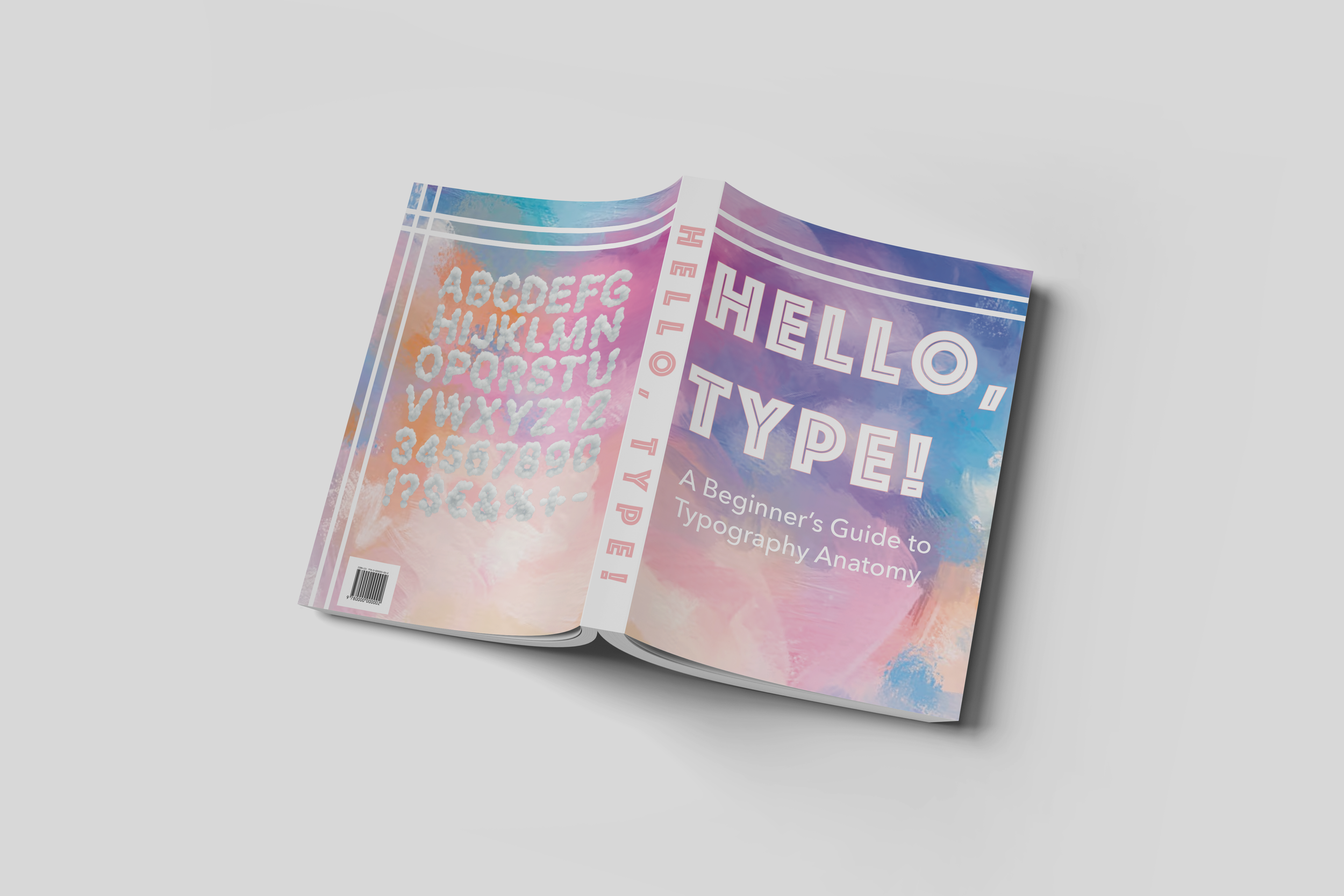
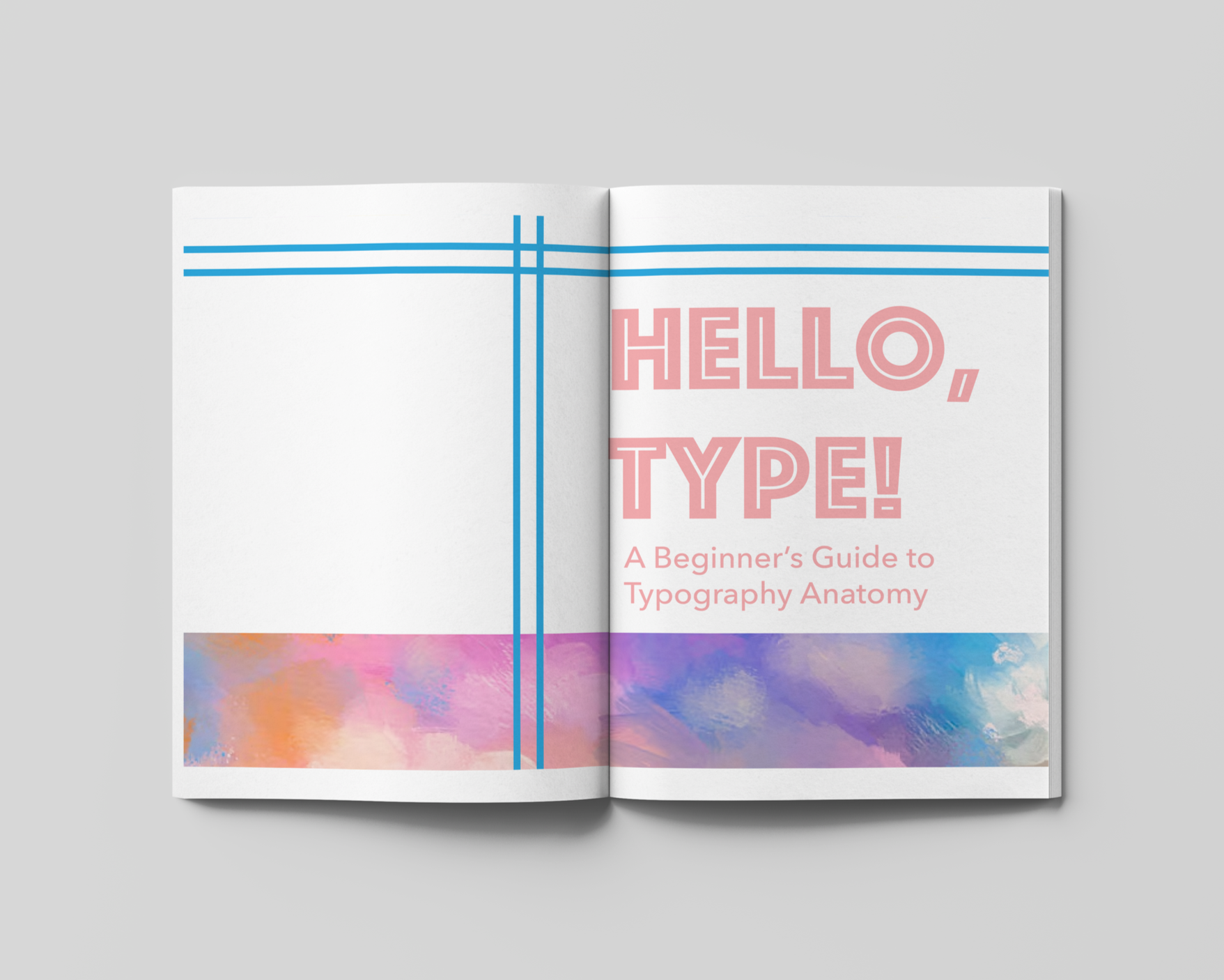
Cover Design: I used a graphic that tied together the whole color palette of the book (blue, green, yellow, and pink) in a visually pleasing way. I made sure to keep the text color black or white to keep things streamlined. I feel like through the cover, I established that this is a fun, colorful, and engaging textbook about typography anatomy for beginners.
Design Solution: I designed a typography textbook that is a fun, colorful, and engaging beginner's guide to typography anatomy.
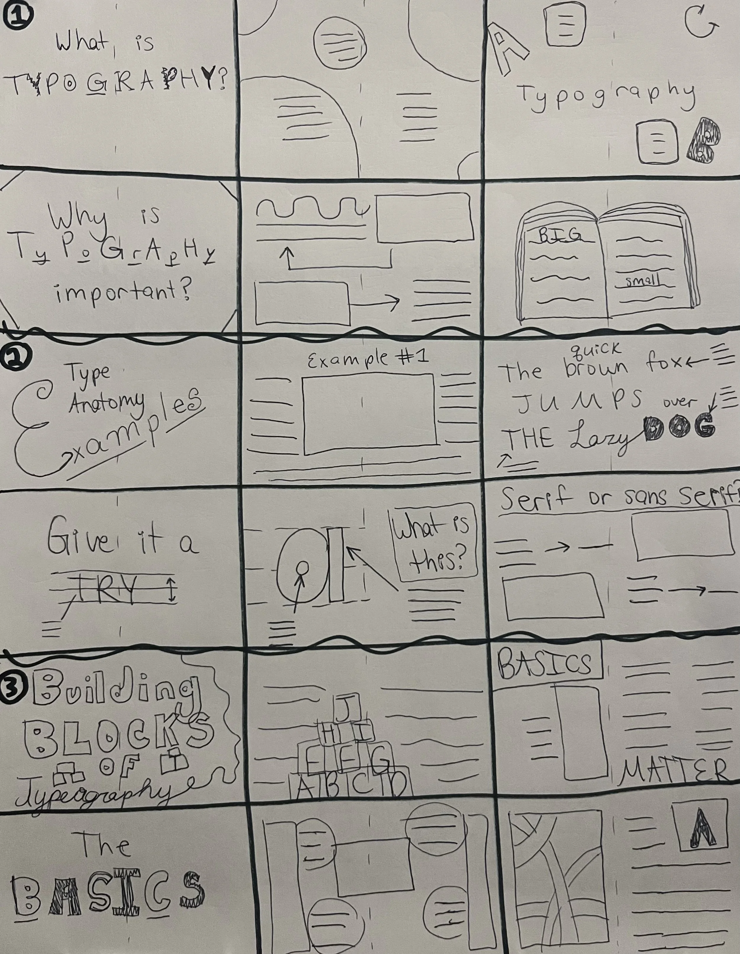
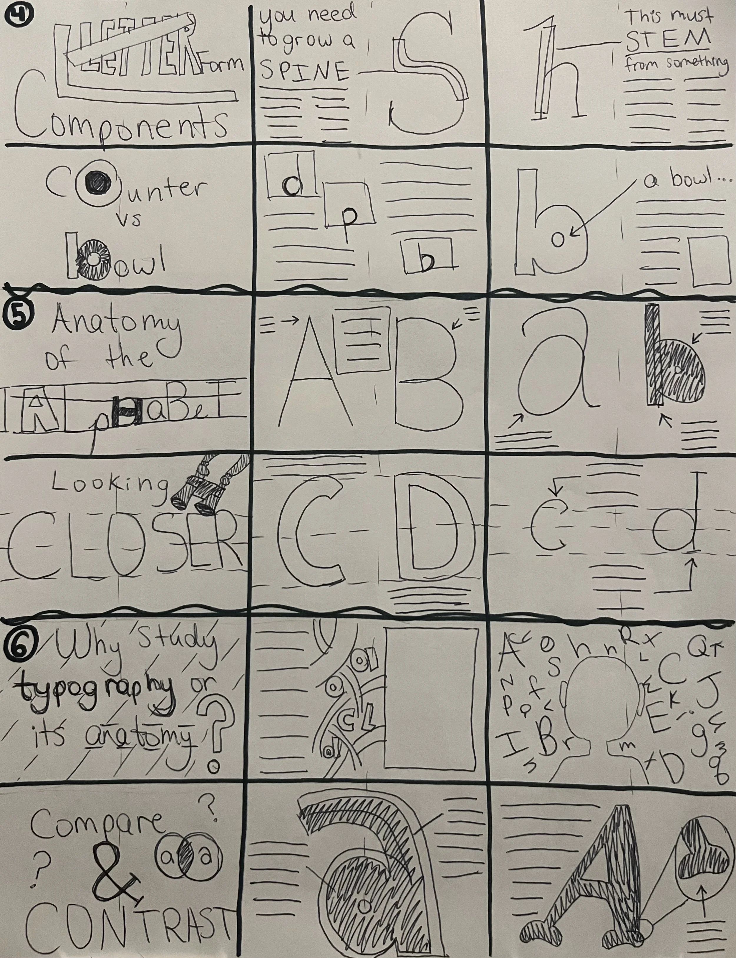
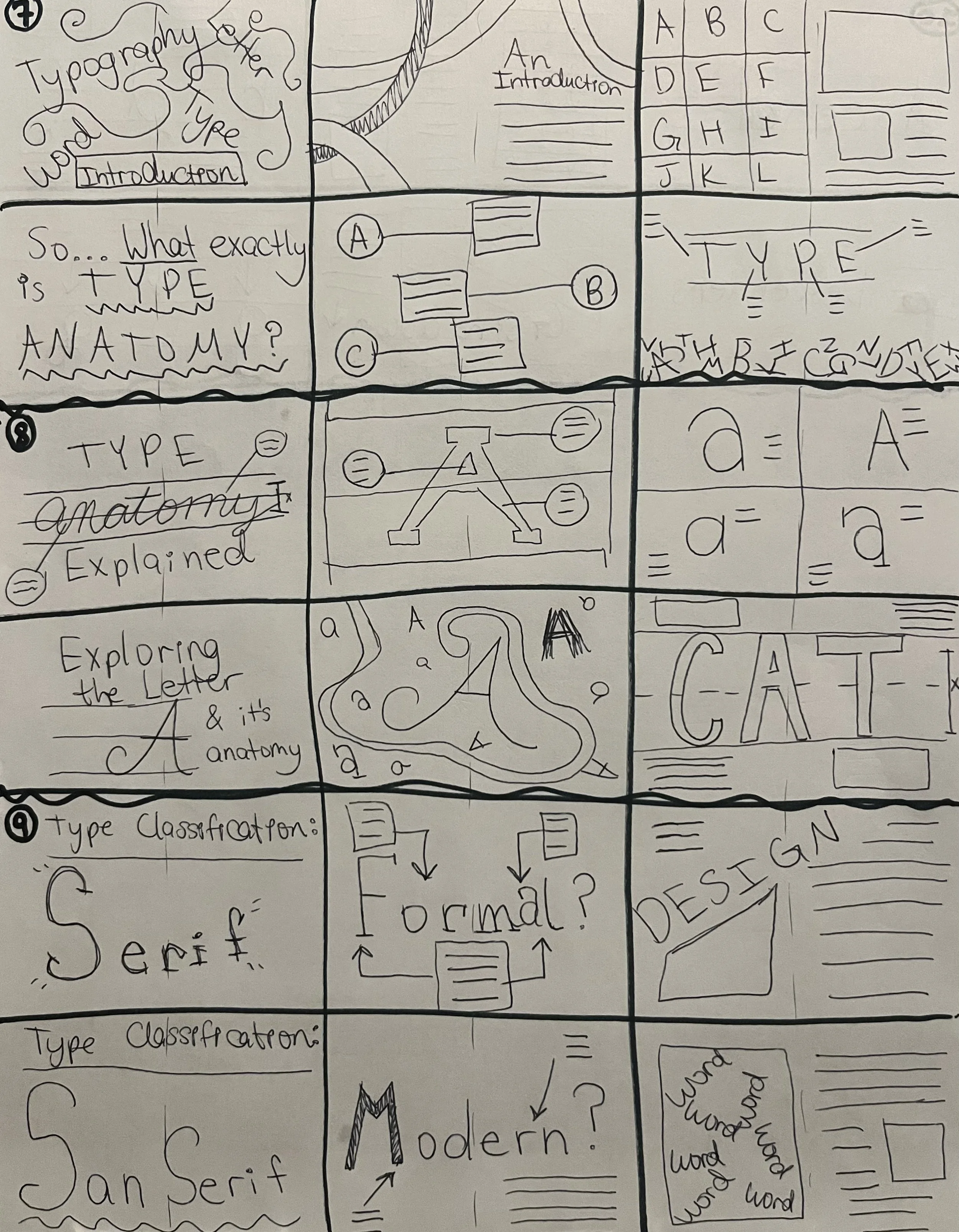
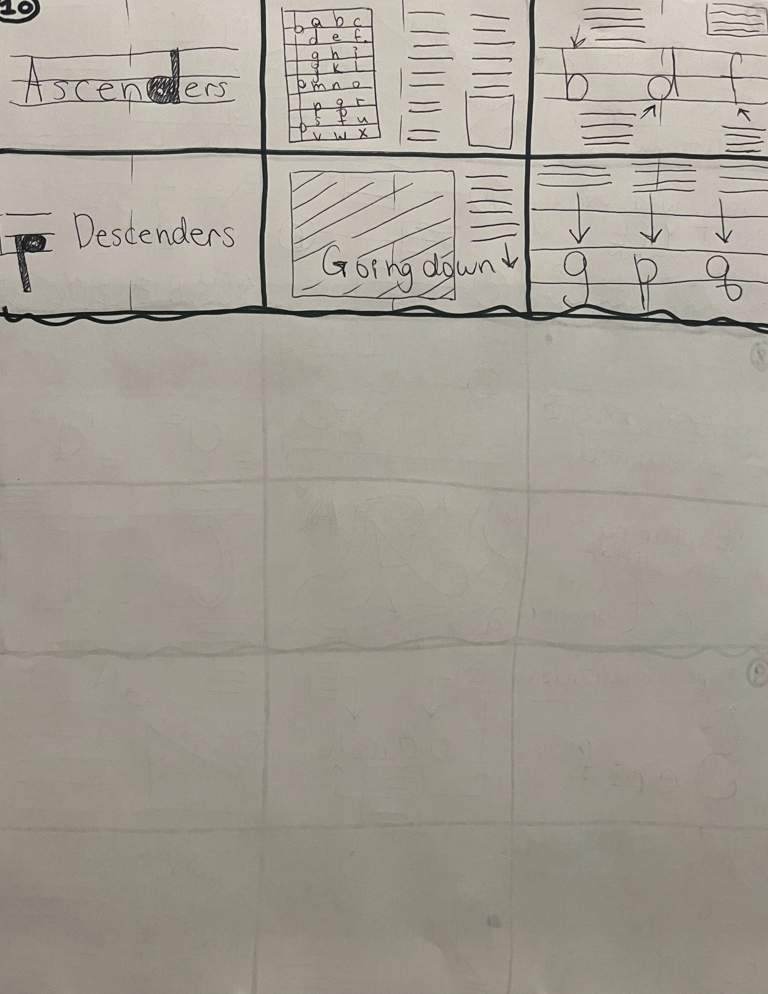
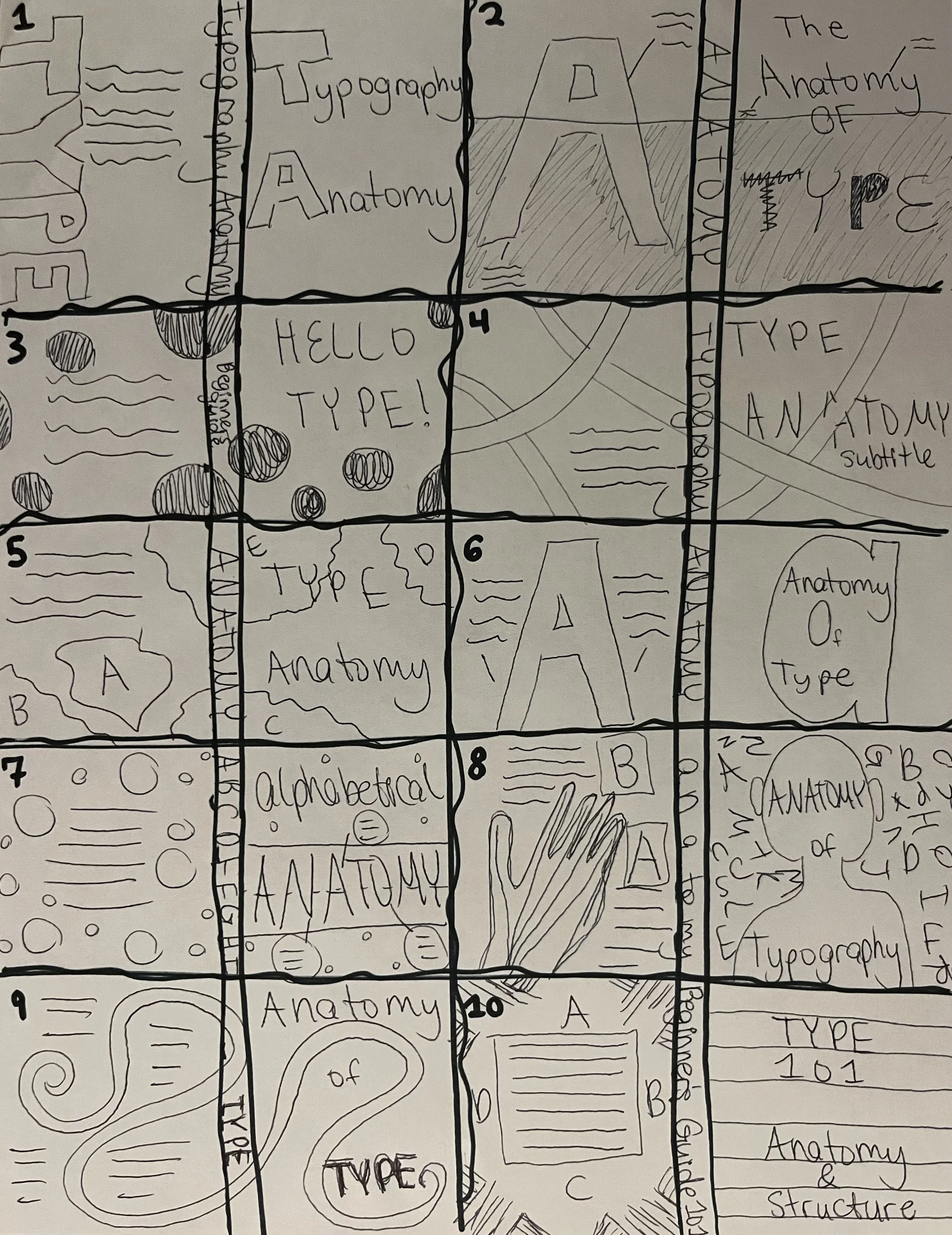
Process Images:
Typography Project 2: Vectoria Nova
Vectoria Nova is great for logos as well, and it perfectly represents the strong foundations of a construction equipment company.
Vectoria Nova is great display font for young adult dystopian book covers.
Check out a Vectoria Nova logo here too! It can be a powerful punch to any drink.
Vectoria Nova gives an out-of-this-world and groovy feeling for a billboard that perfectly matches the vibe of the 2026 Volkswagen ID. Buzz.
Design Process
Software: Illustrator
Design Problem: Design a full character set A to Z
Target Audience: People interested in using a font
Background: I wanted to make a thick geometric grid-based typeface that felt retro but also futuristic.
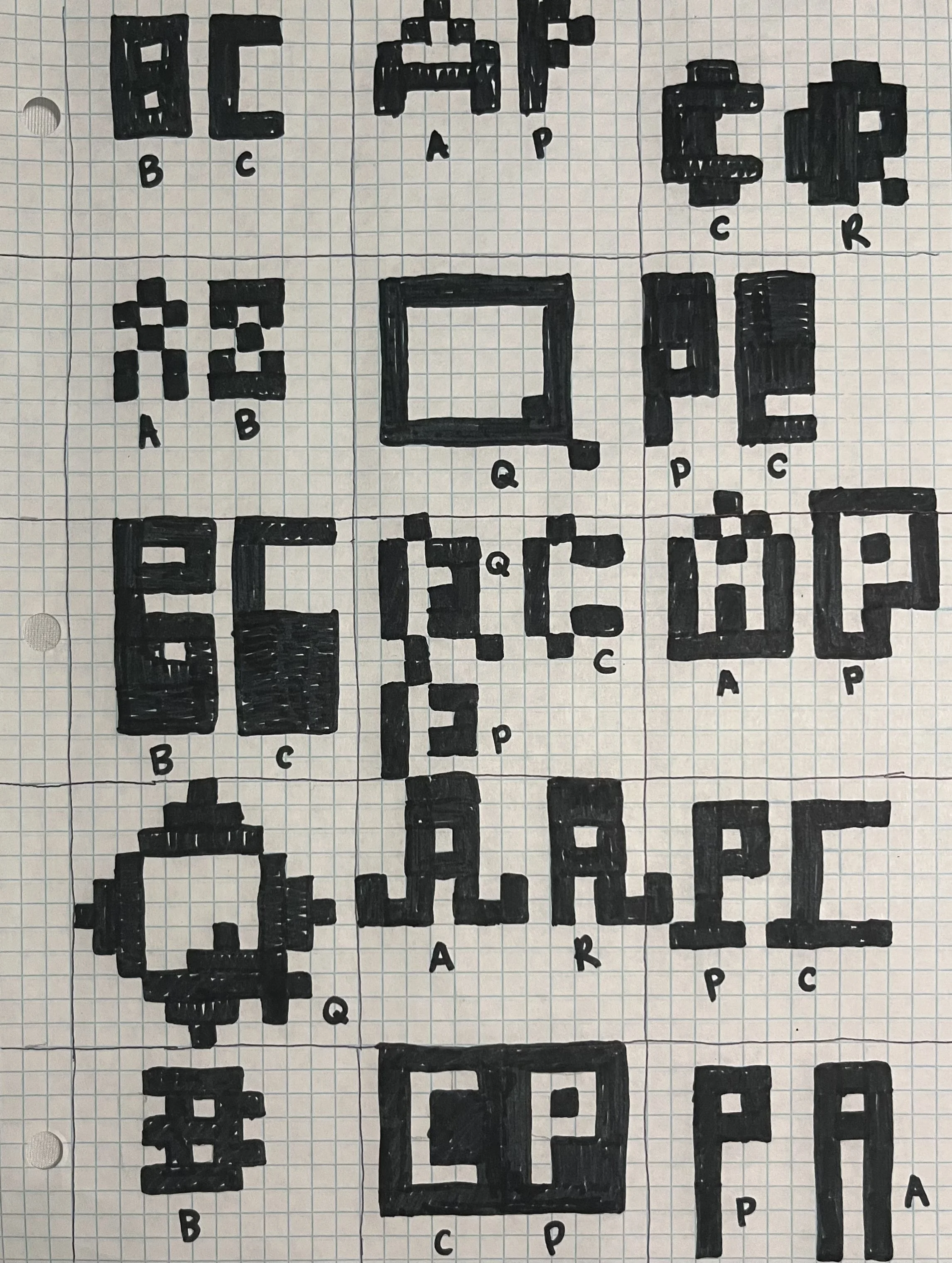
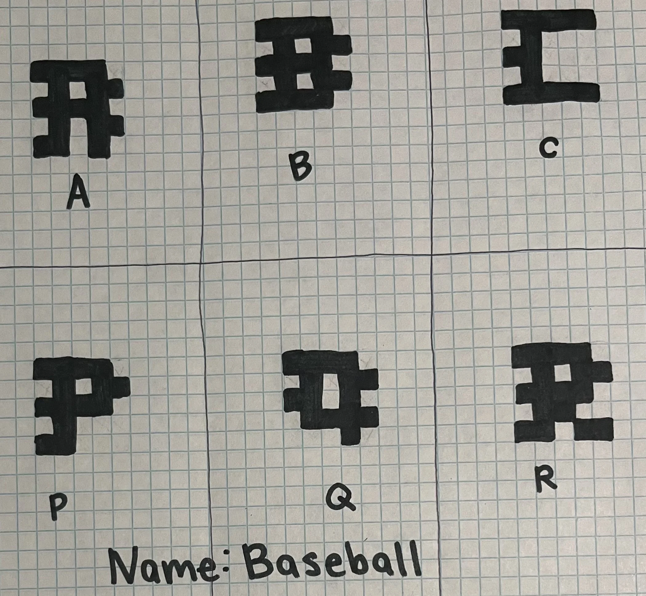
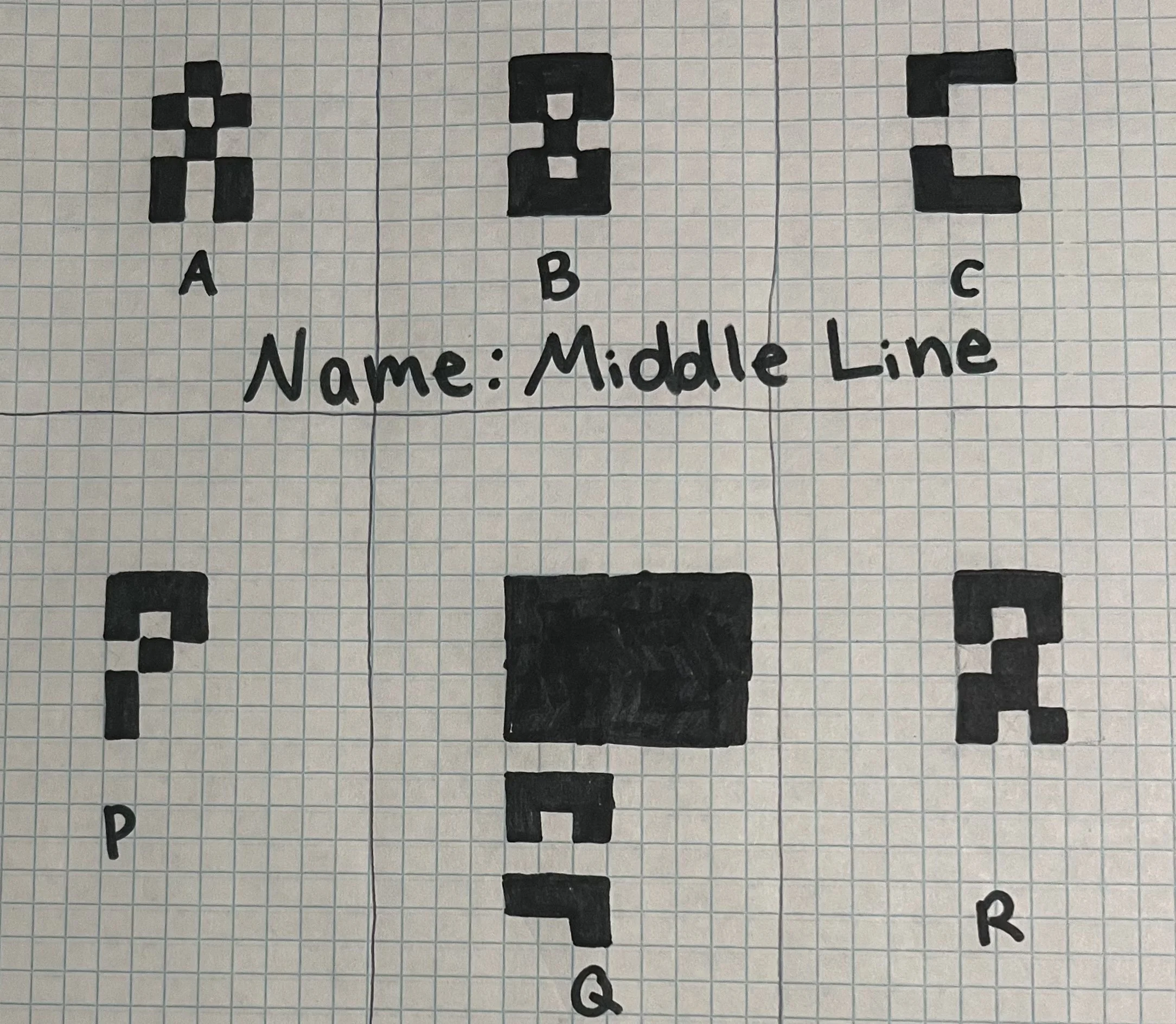
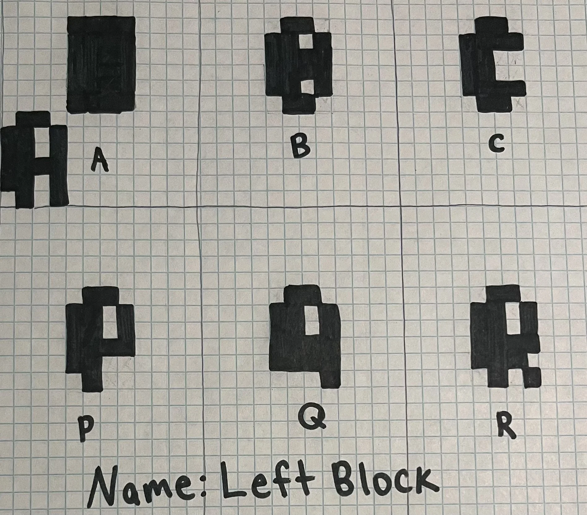
Design Process: I started off my designs by making sketches on grid paper. I wanted to make the letters using the same size squares. I tried out a lot of various designs on paper to see which direction I wanted to go in, and from there, I tested out which designs worked best in Illustrator. I continued making refinements in Illustrator until my font really started to take shape. In the end, my font was leaning more towards bold blocks that have a very distinct Brutalist, monolithic, and retro-futuristic feeling.
Design Solution: I designed a font that feels bold, modular, and architectural.